Little known fact about my husband … In between baseball seasons he painted a whole inside and outside of a house. So he knows his paint. He’s also a great painter. We didn’t do it all ourselves (and if you need a name of a guy locally please contact me – he did a great job!) but JB did paint a couple of rooms. And we still have a few left to finish. But since JB had painted quite a bit before he knew not to buy bad paint (!!!!). JB could write a dissertation on the horrors of cheap paint. While I was mostly concerned with no or low VOC. Turns out you can get very low (and even zero) VOC paint from both Sherwin Williams and Benjamin Moore. I used the regal select matte finish at Benjamin Moore and Emerald Flat Sherwin Williams. Just to satisfy my curiosity I did pick up a little tester of Devine paint at Target which has zero VOC. But it literally felt like I was painting with water color. Since we weren’t living at our house at the time I didn’t worry too much as long as the colors we picked out could be low VOC. We will likely finished the rest of the house next time we’re out of town.
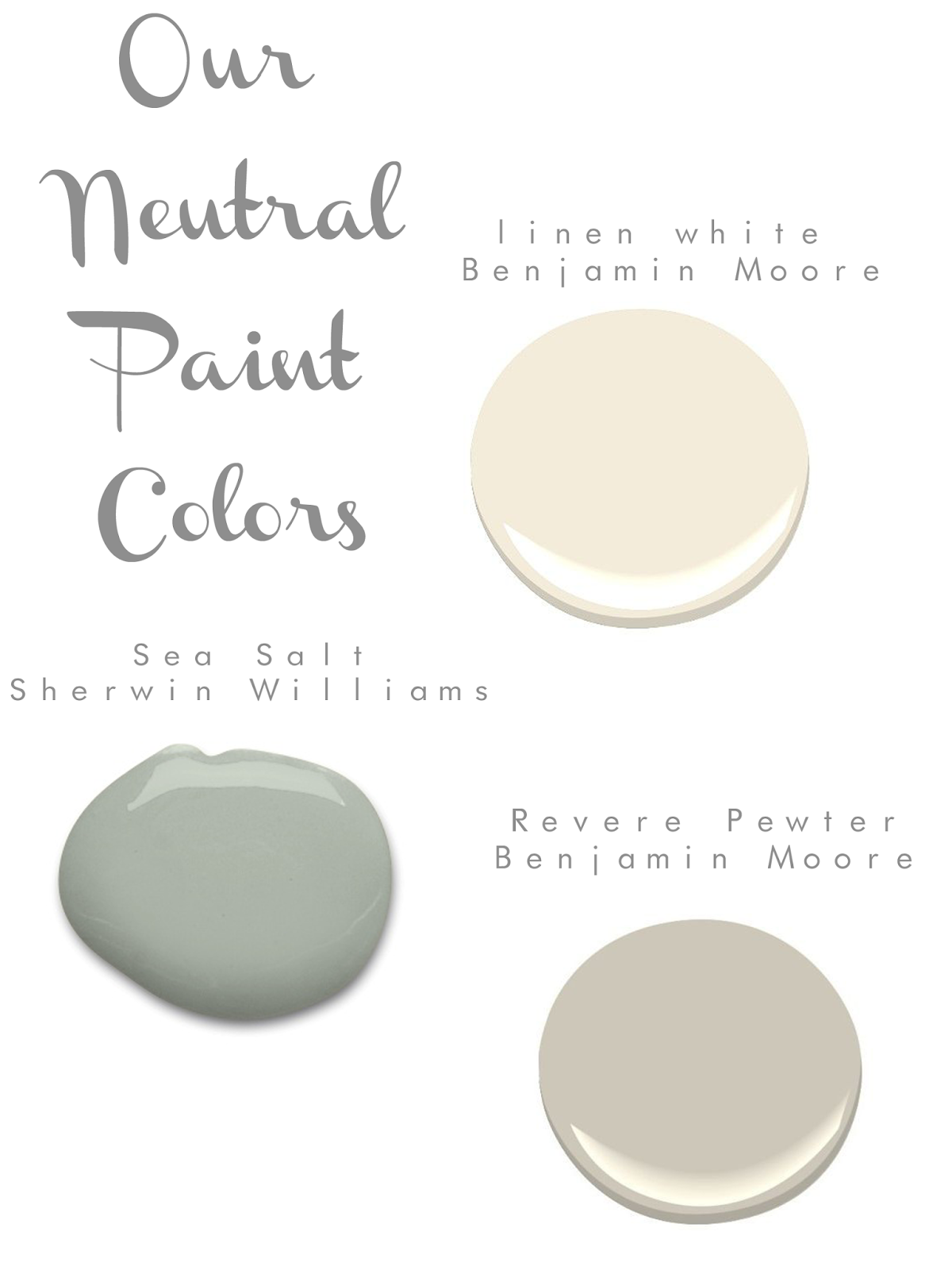
A little about each color:
Linen White: I used this in Tucks nursery in our old house and liked it so much that we put it in Tucks playroom and we will put it in our guest room. Both to lighten up the spaces. This color looks like a cup of cream to me!
Sea Salt: This color is one of those I didn’t expect to want to put everywhere. It really takes on a different color in the different rooms I have it in. We have it up our stairs, in tucks room, and will put it in our bathroom. When I saw the swatch I asked if they were suuuuure it’s sea salt because it looked so gray. But then when I tested it in each room it took on different colors. In our hallway it looks more grayish blue at first and then as you go up turns greeny gray, in tucks room it looks almost mint, and in the bathroom it is a minty green gray.
Revere Pewter: Also known as the most popular paint of all time. I was worried as I thought maybe gray would be depressing. But wasn’t sure what to do in our kitchen that spills into our breakfast nook. We have white cabinets though and I thought white would just be too much white. {is there such a thing!}. Love it in our formal dining too. But wow does it look almost brown when I tested it in the guest room. I think this color needs a lot of light to make it look so airy. As with likely all paint colors (:
I realize Sea Salt may not seem super neutral but for me who looooooves turquoise, it definitely is.
Any other favorites?! I love looking at this sort of thing!